4 Sentinel Charts to Monitor Your Sales Comp Program
Millions of dollars pass through sales compensation formulas annually. So, it’s only fair and necessary to ask, “How well is the sales compensation program functioning?” Having readily available analysis will provide an immediate perspective.
Sales compensation strategists can monitor the health of the sales compensation program by producing four sentinel charts.
- Plan Catalog Summary: an overview of all plans
- Labor Market Comparison: competitive pay level assessment
- Pay/Performance Distribution: dispersion chart of pay and sales outcomes
- Quota Outcomes: performance against assigned quota
These four charts will provide an informative assessment of the overall sales compensation program plus useful insights into specific job incentive plans. We suggest preparing/updating these charts quarterly.
Chart 1: Plan Catalog Summary
Each sales job has its own sales compensation plan. Sales organizations with few jobs can summarize the existing plans using PowerPoint slides. However, for organizations with numerous sales jobs, it’s best to create a “spreadsheet” summary of all the plans.
Here is an example of a plan catalog summary chart:
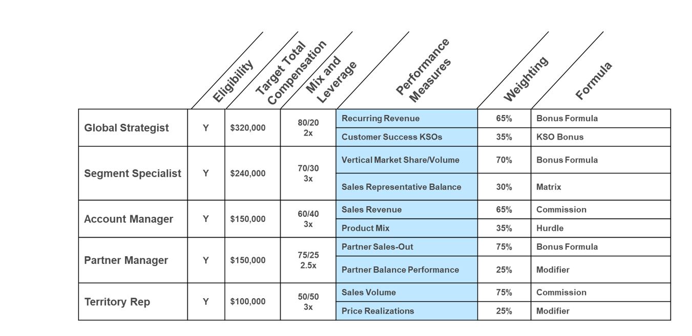
The first column lists the job titles. The additional columns include:
- Is this job eligible for sales compensation? The column could be made more specific to note the type of plan: sales compensation, team award only or company bonus plan.
- Target Total Compensation. This number is the target amount of base plus target incentive. It should be competitive with labor market practices.
- Mix and Leverage. Mix is the split of target total compensation into base pay/target incentive. The leverage is the upside earning opportunity for the best performers, 90th The leverage is a multiplier of the target incentive amount (e.g., 2x, 2.5x and 3x).
- Performance Measures. This column lists the performance measures used in the plan.
- This column includes the weights of the measures in the incentive plan, which should add to 100%.
- This column lists the formula type.
Why Prepare? Often, companies have a corporate sales compensation policy statement and even design principles, which inform the design of sales compensation plans. A plan catalog provides a quick scan to identify plans that are inconsistent with company policies. For example, the company may wish to restrict pay mix practices to be no lower than 85/15 and no higher than 50/50 (base salary/target incentive as a portion of target total compensation). This chart would highlight those exceeding the guidelines.
There should be symmetry among the plans. For example, if multiple sales divisions have an account manager job, how similar or dissimilar are the incentive designs among these plans? A significant variance may (or may not) lead to plan updates during the next design cycle.
Chart 2: Labor Market Comparison
Compensation planners want to ensure target pay levels are competitive with labor market rates and consistent with internal company practices.
For each job, prepare a percentile comparison chart.
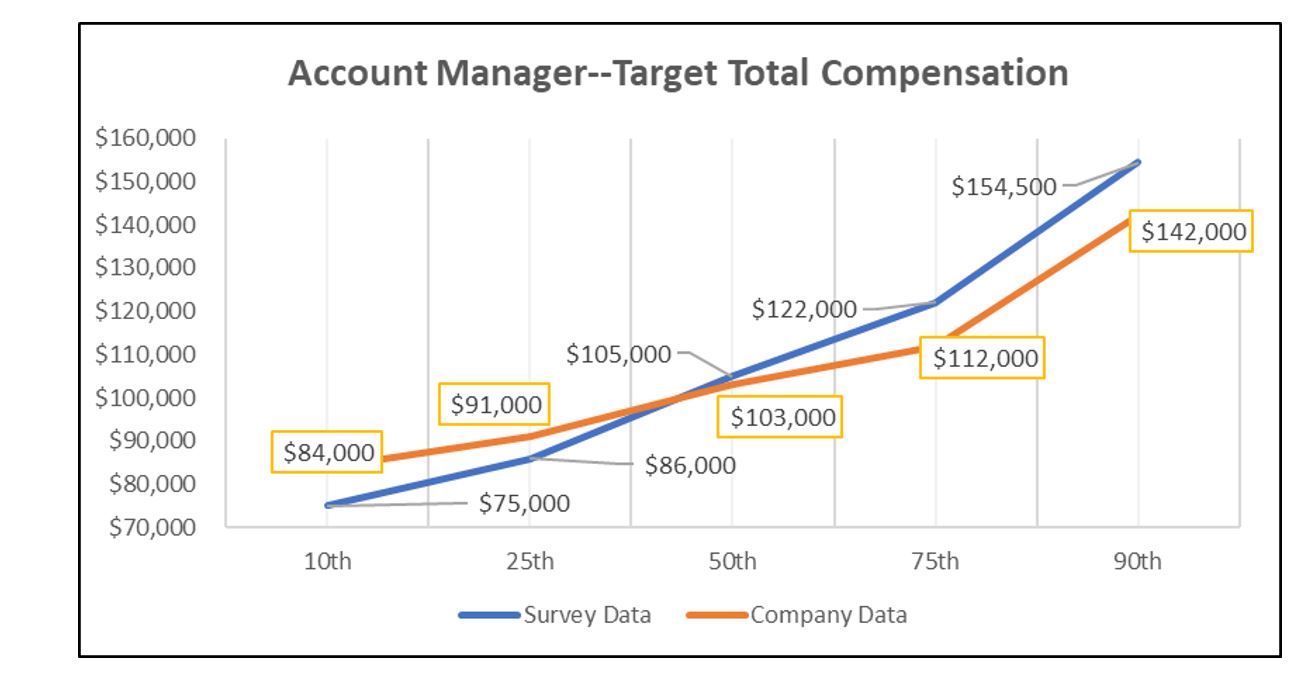
Of interest, the pay variance between the company’s target pay level and the market is almost alike at the median (50th percentile): $103,000 for the company’s data and $105,000 for the survey company’s data. However, looking at the full data set, the account manager’s target compensation levels are above the market for pay practices less than the 50th percentile, and less than the market practices above the market 50th percentile. This confirms that looking beyond the median (or average) is necessary when assessing labor market pay data for sales jobs.
Why Prepare? This chart provides a visual picture of the competitiveness of the company’s target pay practices. Another version of this chart displays actual annual payouts versus market practices. Again, prepare this chart for each job. Compensation managers should correct variances between company practices and survey data consistent with pay increase policies and cost limitations.
Chart 3: Pay/Performance Distribution
Does pay match performance? The best method to evaluate pay/performance distribution is to plot actual practices. In the following chart, performance is expressed as percent of quota achievement. Plot each participant’s pay/performance outcome: how they performed and what they got paid.
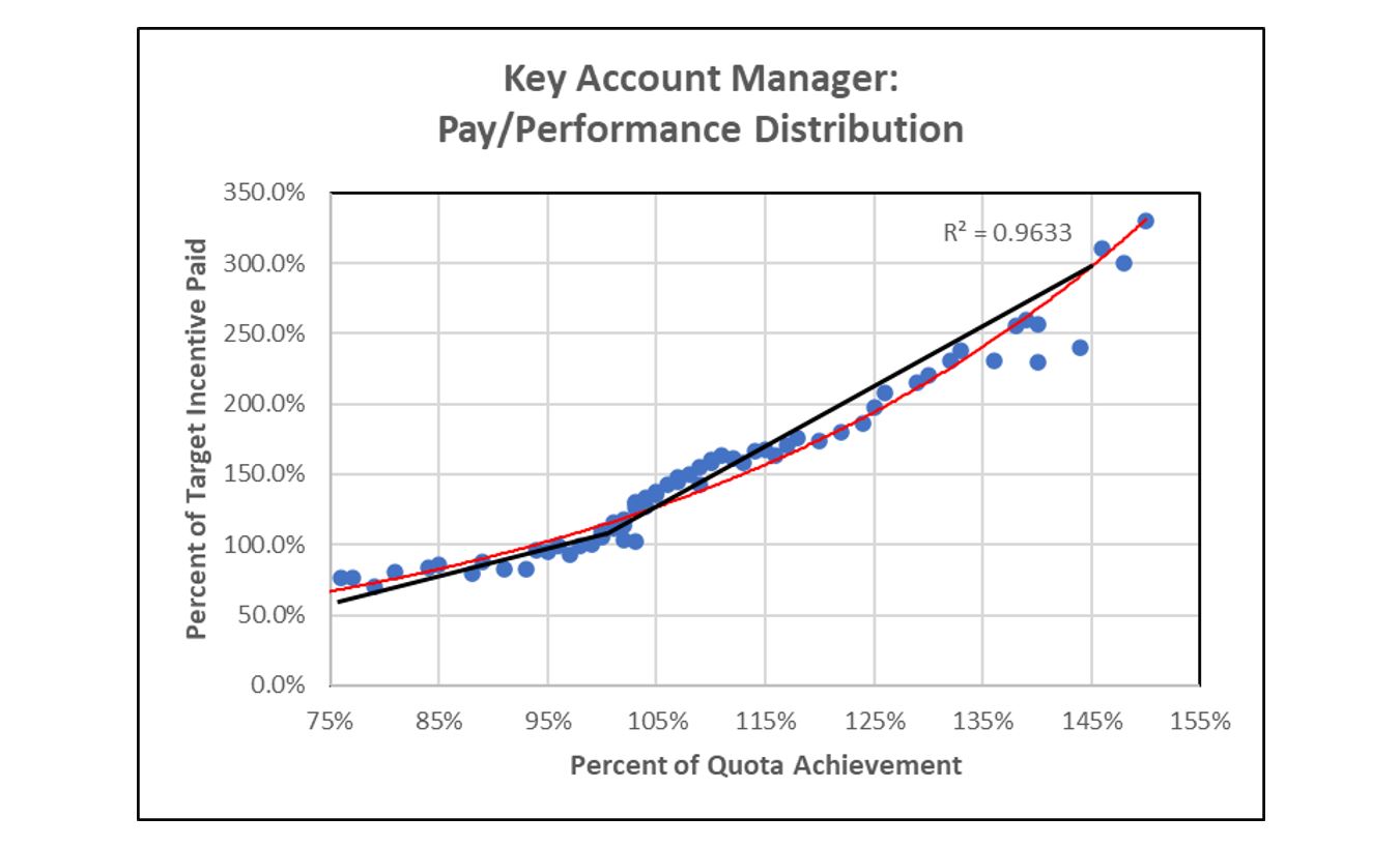
As the R2 of .9633 suggests, there is a close connection between pay and performance. However, above 100% quota, several performers were paid below the target payout trend line. Next step: Investigate why these high performing sellers received less than the anticipated payout. While this example displays variance between pay and performance, the difference is minor. Most likely, the cause is non-consequential but worthy of investigation. Make suitable corrections if necessary.
Here is an example of a poor relationship between performance and pay:
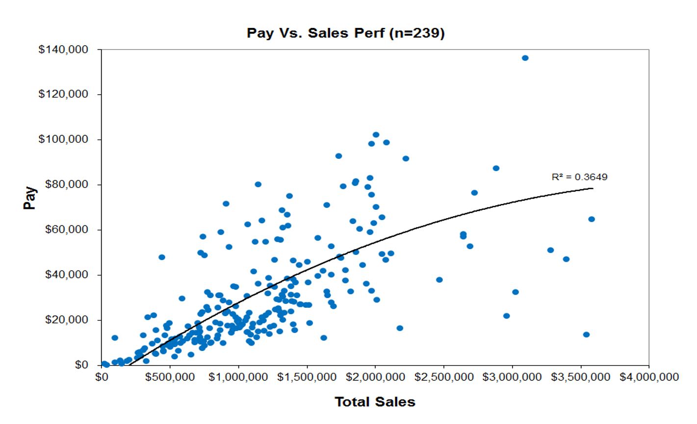
In this commission plan, there is a very low R2 of .3649 suggesting a minor relationship between pay and performance.
Why Prepare? The pay/performance dispersion chart shows how the pay plan paid each participant as compared to expected payouts. Any variance requires further investigation to determine the source of the disparity between pay and performance.
Chart 4: Quota Outcomes
Many sales compensation plans tie payouts to quota performance. This places a heavy burden on ensuring the quotas are equitable, reasonable and balanced. No quota system is perfect. However, well-functioning quota systems produce a preferred distribution of performance.
While practices vary, most sales executives anticipate that 55% to 65% of all sellers will achieve quota. Although this may be the objective, the outcome is closer to 50% of the sellers’ achieving quota. [Source: the Alexander Group’s 2022 Sales Compensation Trends Survey]
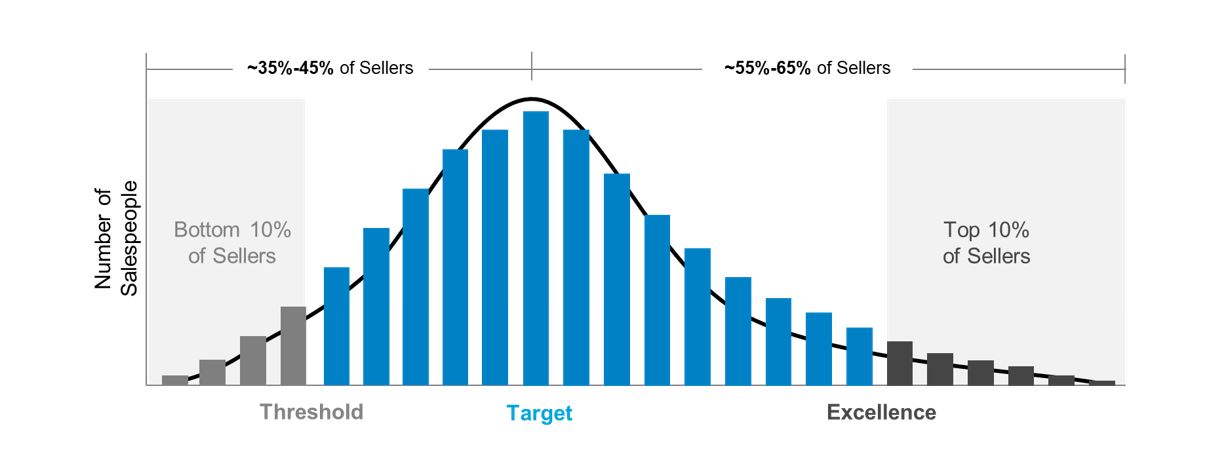
Best Practice/Desired Quota Distribution
- 90%-95% of salespeople reach threshold level
- 80%-85% of salespeople perform between threshold and excellence level
- 55%-65% achieve or exceed target or “at-plan goals”
- 5%-10% of salespeople reach excellence level
- Bottom 5%-10% enter performance improvement program
When plotting actual results, look for any skewing of the data:
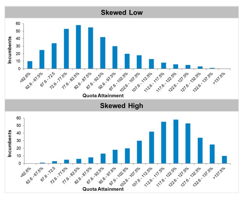
Too much skewing left means the quotas are too hard. Too much skewing right and the quotas are too easy.
Why Prepare? Quota charts can identify successful quota practices. They will also identify quota systems that are hurting sales compensation outcomes. Unfortunately, these charts will not answer “why” the quota system is not functioning correctly. But they will identify when quota for a specific job is misaligned with the preferred outcome. More investigation is necessary to identify the source of the quota variance from preferred outcomes.
Summary
It’s best to have ongoing production of these charts:
- Plan Catalog Summary
- Labor Market Comparison
- Pay/Performance Distribution
- Quota Outcomes
These charts will function as sentinels overseeing the effectiveness of the sales compensation program.
_______________________________________________________