With accounts grouped into clusters of similar customers, it stands to reason that each “in-group” customer should be able to spend in the range of the upper percentile of the cohort to which they belong (e.g., 80th). For the 20% of customers whose sales exceed the 80th percentile of sales for that group, their potential is stepped up incrementally until the cluster’s high water mark is hit. Here’s how it works:
Technology
Is Your Organization Focused on the Right Accounts?
Author

Sean Backe
Director
Using K-Means Clustering to Build Potential-Based Segments
The Four “R’s”
All commercial organizations are faced with the questions of “are we focused on the ‘right’ customers, with the ‘right’ coverage, with the ‘right’ message, at the ‘right’ time?” Historically most businesses answered these questions based on the opinion of Product Marketing “gut feel” or by converting business logic into simplistic scoring models. The most sophisticated go-to-market (GTM) organization built multi-variable regression models to get powerful, predictive insights about the underlying potential of each customer. However, this process required significant translation between highly technical data scientists and revenue leaders who were closer to the business.
More recently, best-in-class GTM organizations use machine learning models to close the distance between those doing the modeling work and those who have the critical business context to interpret model outputs. This has had the dual benefit of both increasing model accuracy while decreasing time to value. This article focuses on how machine learning models can help the commercial organization build better potential models which, in turn, provide insights into who the ‘right’ customers are and what the ‘right’ coverage model is for them.
Building Better Potential: The Power of K-Means Clustering
Building better customer potential starts with answering the question of “which customers are most similar to each other.” These groups (going forward we’ll call them “clusters”) of similar customers (customers that have similar demographics, persona characteristics and/or exhibit similar buying behavior) will need to have their own “algorithm” for determining potential. The assumption is that these unique characteristics that describe each cluster play an important part in understanding potential, and it would be inaccurate to rate potential the same across different clusters. However, the issue then becomes coming up with the right clusters.
Machine learning algorithms, such as K-Means clustering, make it dramatically easier to perform this task.¹ This algorithm compares how similar customers are to each other across dozens of different data points simultaneously. The resulting output is unique groupings of customers with each account being similar to the ones in their cluster and differentiated from accounts in other clusters. In the following illustrative visual the clustering algorithm organized customers into five distinct groups.
Get the latest insights delivered to your inbox
Subscribe Now
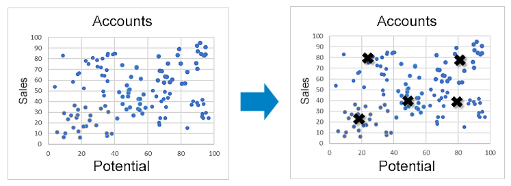
Figure 1: Example K-Means
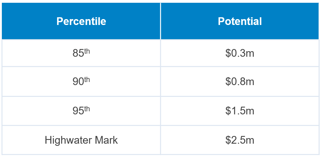
Figure 2: Example Potential Table for a Single Cluster
For each of the individual clusters identified, there is a potential table created based on the revenue percentiles within that cluster. In the illustration above, each account within that cluster will receive one of four potential values. All accounts below the 85th percentile will receive that value for potential. Accounts between the 85th & 90th percentiles will receive the 90th percentile, accounts between the 90th & 95th percentiles will receive the 95th percentile value, and so on. Ultimately this results in a set of absolute potential metrics equal to the number of cut lines multiplied by the number of clusters. If, in this example, the company had 11 clusters the model would assign one of 44 potential values to every account.
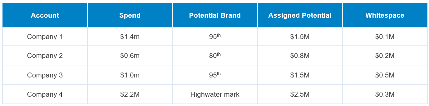
Figure 3: Generating Unique Whitespace Values
With a potential assigned whitespace, prioritization becomes possible. In the illustrative case in Figure 3, Company 4 has the highest absolute potential. However, Company 3 has the most whitespace remaining in the account. Sales should put slightly more emphasis on Company 3 for that reason.
This approach has several advantages over traditional methodologies for assigning potential, including:
- Simple Inputs: Only historical company data is required, reducing the need for complex fuzzy matching of 3rd party data sources.
- Rugged Algorithm: The model is less sensitive to imperfect data than regression-based approaches.
- Customer Differentiation Incorporated: Model does not assume all customers are alike. By breaking accounts into sub-segments, it “tunes” the results to each specific subsegment avoiding a “one-size-fits all” approach.
- Simplifies Messaging: Models that generate unique potential values that produce outputs such as “Company 5 has $837,415 dollars in potential” tend to be met with skepticism by sellers and management alike, who correctly intuit that even the most sophisticated potential models cannot truly make accurate predictions at that level of specificity. A cluster-based approach, if presented correctly, can be simpler to communicate with more than enough accuracy for commercial purposes. For example, reps can be informed that “Company 4 is one of our top accounts and it has 3.7x more potential than Company 2.” Assuming the accounts in question pass the sniff test that messaging tends to be more effective at shifting seller focus to the most valuable accounts.
A Recent Case Study
Alexander Group recently developed an potential model for an ERP provider that took in 29 distinct measures (e.g., # of purchased licenses, product mix ratio, # of open opportunities, # of employees, etc.) to create 10 distinct customer groups. Given the model already demonstrated that each account was similar to the rest of its “cluster”, Alexander Group assigned the 85th revenue percentile of the cluster as the potential for that group. Potential for accounts with sales above the 85th percentile was “stepped” up, with the account with the highest sales in the cluster setting the high water mark for that group.
Right Customers: Ideal Customer Profiles
With potential calculated, this analysis can further inform the organization on coverage models that are appropriate for each of the customer profiles.
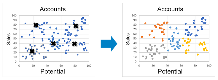
Figure 4: Example K-Means
With those groups identified it becomes clear that not only should the orange, blue and yellow customers be targeted, but also which plays to run for each cohort.
- “Blue” customers (high sales, high potential) should be actively covered to expand the accounts.
- “Yellow” customers (low sales, high potential) should receive a business development motion to land new customers and drive adoption of existing accounts to increase ACV.
- “Orange” customers (high sales, low potential) should receive just enough touch to protect the already captured revenue.
- Finally, “Grey” & “Teal” customers (low sales, low potential) should be deprioritized relative to the other groups given they have neither significant sales nor substantial potential.
A potential coverage map for these accounts could look the following:
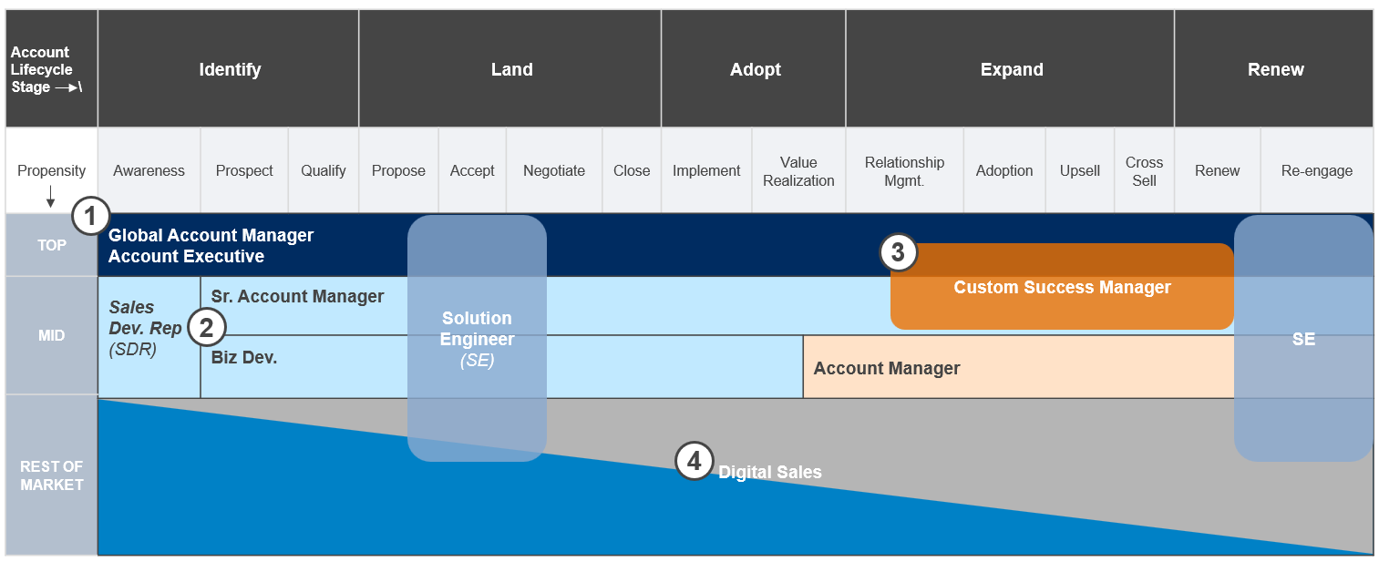
Figure 5: Potential Coverage Map
- “Blue” accounts (High Potential – High Sales) will slot into the top segment receiving either global or enterprise account treatment.
- “Yellow” accounts (High potential – Low Sales) accounts will get assigned to “Land” reps such as Business Developers and Sr. Account Managers.
- “Orange” accounts (Low Potential – High Sales) are assigned to pure account management functions.
- “Grey” & “Teal” accounts (Low Potential – Low Sales) are assigned to low-cost digital models
Right Coverage: Potential Based Segments
Identifying the right customers to target is only useful if it leads a commercial organization to treat those customers differently than the rest of the portfolio of accounts. The simplest and most robust way to accomplish differentiated treatment is through segmentation.
Alexander Group defines segmentation as the grouping of customers/prospects with similar needs, who require similar work and have similar potential. The purpose of organizing the portfolio this way is to apply coverage models that have the capability to meet the needs, the capacity to service the workload and a cost envelope that is appropriate for the level of potential.
Once the portfolio is organized into clusters of similar customers, segments can be built based on the level of potential for accounts within each sub-group (see figure 5). The most valuable accounts generally receive expensive field sales coverage, whereas the long tail of accounts are generally shifted into digital/inside sales models. The act of aligning customers into unique segment–role pairings is a significant driver of both productivity and lowered cost of sales.
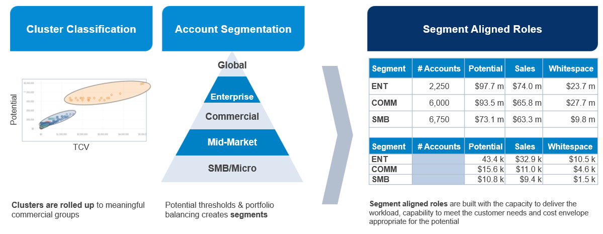
Figure 6: Key Steps to Translate ICP Clusters into Portfolio-Level Segments
What’s Next?
Leveraging clustering models to inform customer segmentation and targeting produces a significant upside for the business. For marketing, it provides guidance on which contacts to prioritize, which ABM campaigns to run and creates a compelling starting point for diving into buyer research. For sales, the amount of remaining potential in an account informs reps on how much coverage intensity to apply to the account.
However, by itself, these algorithms provide limited guidance to sales reps on the specific “Land,” “Expand” and “Renew” plays to run at the specific buyers within each account in their book of business. Future articles in this series will explore additional analytics such as “Buying Alerts”, “Next Best Offer” and “Churn Alerts” that provide compelling, data-driven answers to ensure that the commercial organization delivers the “right message” at the “right time.”
[1] K-Means clustering is an algorithm that first appeared with its current name in 1967. It works by taking data points and iteratively mapping them to a set number of randomly placed center points (the “k”). The algorithm continues to “loop” this process until the center points stop moving at which point the algorithm is said to have “converged”. The best way to understand this algorithm is to see it in action which can be viewed here.

Need Help?
For more information, please contact an Alexander Group Technology practice lead.


